Netflix - Premiere Feature
Context
In 2020, with no sight of the COVID 19 pandemic ending anytime soon, Netflix is looking to expand its viewership. By observing Mulan's success story on Disney + premiere, Netflix is considering doing similar by creating a total theater premiere experience for their viewership, especially the viewers who is willing to pay extra. Netflix wants to create an online theater experience that syncs with theatrical release titles for its users. These experiences will also include live panels with directors and actors and behind the scene features.
-
Design a new landing page for the “premiere” service
Design a purchase/check out system for “premiere” service
Design a signup system for premiere service
Design interface for signing up with the “Live Panel discussion” section.
Design a rating sorting system for the Premiere feature.
-
UX/UI Designer, Branding
-
4 weeks
-
This new experience will not only offer exclusive content and behind-the-scenes features but also include live panels with directors and actors.
Process Overview
The process can be divided into 5 phases: Empathize, Define, Ideate, Prototype & Test.
Secondary Research Goals
Current Market
With 193 million paid subscribers as of April of 2020, Netflix, as one of the largest and most popular online streaming services, pretty much dominates the market. Average streaming paid memberships worldwide increased by 24% and ARPU by 3 % as of Q2 2019. Although as the bell ring to signify the end of Q3 2020, analysis is starting to see a slow down of Netflix growth from its market share, 2.20 million vs. 3.57 million expected, according to FactSet. One cannot oversimplify a problem, but analysts believe that the rise of Disney + popularity plays a major factor in this. One of the biggest intraday of Disney stock in 2020 happened on August 4th. The day Disney announced the long-awaited Live-action “Mulan” would be available and launch on Disney + premiere platform on September 4th, 2020.With 90% of theaters closed due to the Covid19 pandemic, Moviegoers who are eager to watch “Mulan” their only option is to subscribe to Disney + and pay an extra $30 for the premiere services. Installations of the streaming app rose 68% to 890,000 over the weekend, according to Sensor Tower Inc., a sign “Mulan” drove new customers to the service.
Demographics
Netflix is markedly more popular with younger consumers in the United States than among older generations, according to a survey held in March 2020,
25% Gen Z, 18-22 | 25% Millennials, 23-38 | 20% Xennials, 35-45 | 17% GenX, 45-54 | 13% 55+ |
Competitive Analysis
01. Empathize
Research Goals
Verify and validate if this feature is needed and desired
Find out the current "Theatre premiere experience" landscape and see how Netflix Premiere service could stack up against them.
Find out from users what features should be included in Netflix’s new “theatre premiere experience.”
Research Findings
To further understand where Netflix stands in the market and its strengths and weaknesses, I conducted a competitive analysis. I spent some time looking into four other services commonly used to stream video content: Amazon Prime Video, HBOMax, Hulu, and Dinsey+. Out of the four companies, Amazon Prime and Disney + have launched a “premier” service that showcases theatrical releases the same day they release in theater. On the other hand, HBO Max is launching WB/DC movie, “Wonder Woman 1984,” 1 week after its theatrical release. Out of all four companies, Disney plus is gaining the most traction in 2020. With original and theatrical release content, vast behind the scene features, and an excellent overall user interface, Disney plus is the fastest-growing online subscription streaming service to date. However, Amazon Prime still stands as the main competitor for Netflix from the market share perspective.
User Interviews
With a better understanding of the current streaming market, I wanted to gain more in-depth knowledge of consumers' habits and behavior when using streaming services. But most importantly, I want to try and validate if the Netflix premiere feature is needed & desired by users and define what “theatre premiere experience” means from the user's perspective. Five 1-on-1 interviews were conducted over the span of two days.
Participants:
Total of 5 interviews
3 were female & 2 were male
Frequency of going to the movie theater
3 frequently, 2 Occasionally
The age range is from 25 - 45
All interview time ranges from 20-25 mins.
Needs
Netflix Premiere Landing
Behind-the-scene function
Panel talk function
Panel talk signup/reservations
Movies release schedule
Wants
Premiers Expiring Soon
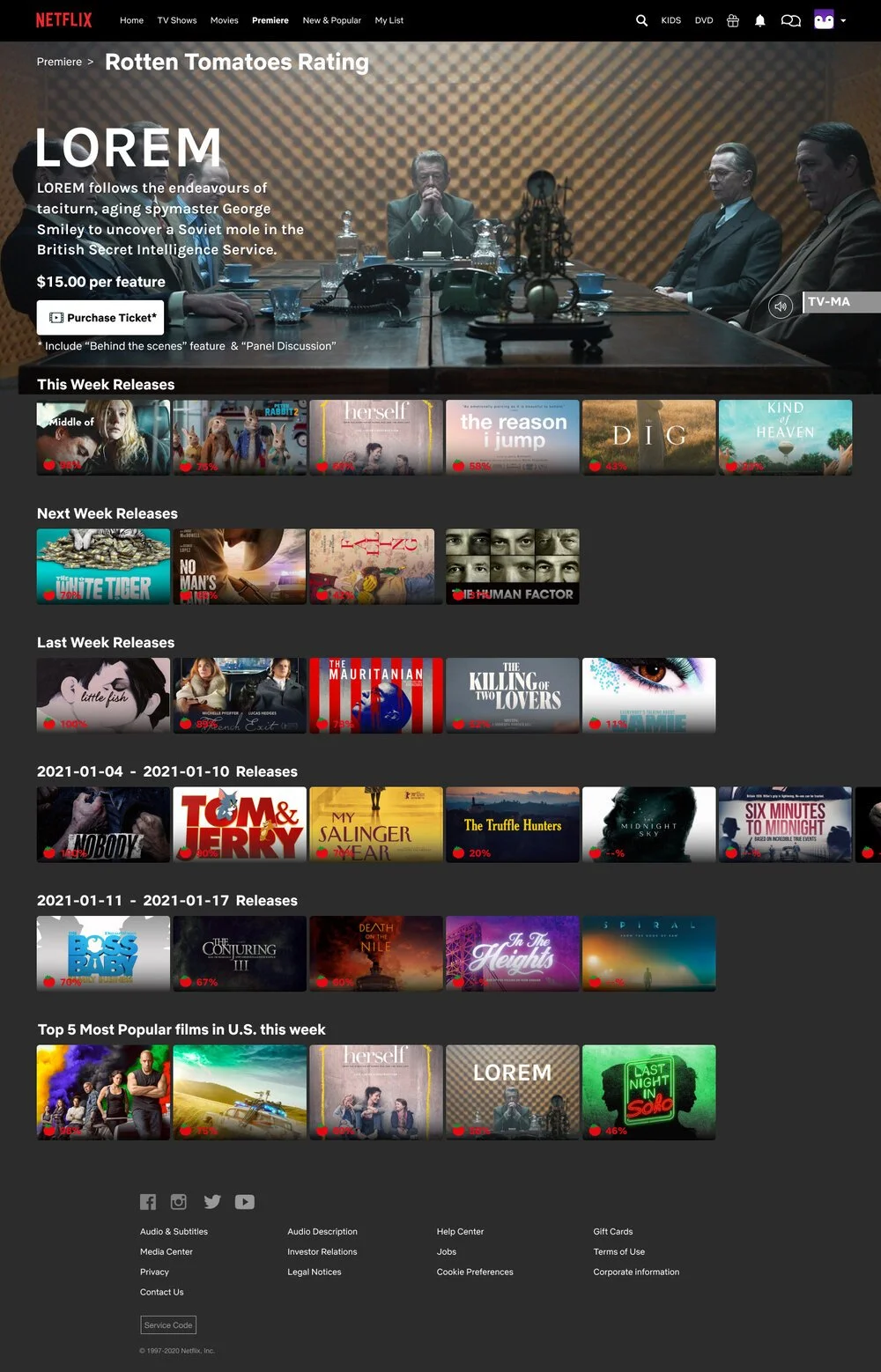
IMDB or Rotten Tomatoes rating on movie detail area
Opportunities for Improvement
Easy Checkout system
Sorting system to add-into existing search system for the “Premiere feature.”
Different price plan for premiere service
Qualitative Takeaways from Interviews
Overall, research findings showed that most streaming service and Netflix users find interest in having the ability to watch theatrical releases on Netflix’s Premiere service for various reasons.
“I am really not a big fan of disruption, plus I do enjoy rewind and rewatching a certain line being performed again if I find it interesting, and this is not something that any theater can do,”
“I could be having ramen and tacos while watching this movie instead of just popcorn ….,”
“ I would do it for the obscure smaller movie that my friend doesn’t want to see or if it was somehow cheaper than the theater.”
Of what defines a good “theatre premiere experience,” most users express the need to have a Behind-the scene function & Panel talk function because it gives the feature more value and an overall immersive experience.
Across the research, users expressed frustration with finding the right movie to watch on Netflix or other streaming services. Users suggested some feature such as “expiring soon list” and “movie rating system" can help them prioritize and determine what movie they should watch next.
Persona
Using the insights gained from the competitive analysis and user interviews, I identified an ideal target user through a persona. Despite his unique upbringing, John's goals & frustration represent the large portion of movie theatergoers who find it increasingly difficult to watch new movies or attend directors’ panel talks in person during the COVID-19 pandemic. By giving context and personality to the research data, we can better empathize with the target user throughout the design process. This is a reference tool that I used throughout the rest of the design process — every time I had to make a design decision, I thought about how John would benefit.
Empathy Map
To further explore relationships and develop the persona that emerged from the data, I gathered and mapped an empathy map made up of observations and statements during user interviews. This empathy map was designed with three quadrants – saying, doing, thinking & feeling to organize my research and keep a human-centered view of the product. Diving deeper into John's mindset helped me further understand the user's emotional state.
02. Define
Feature Roadmap
Based on my secondary competitive research, primary user interviews research, persona, and considering time constraints, I decided to focus on the following features and task flows to create a Minimum Viable Product (MVP).
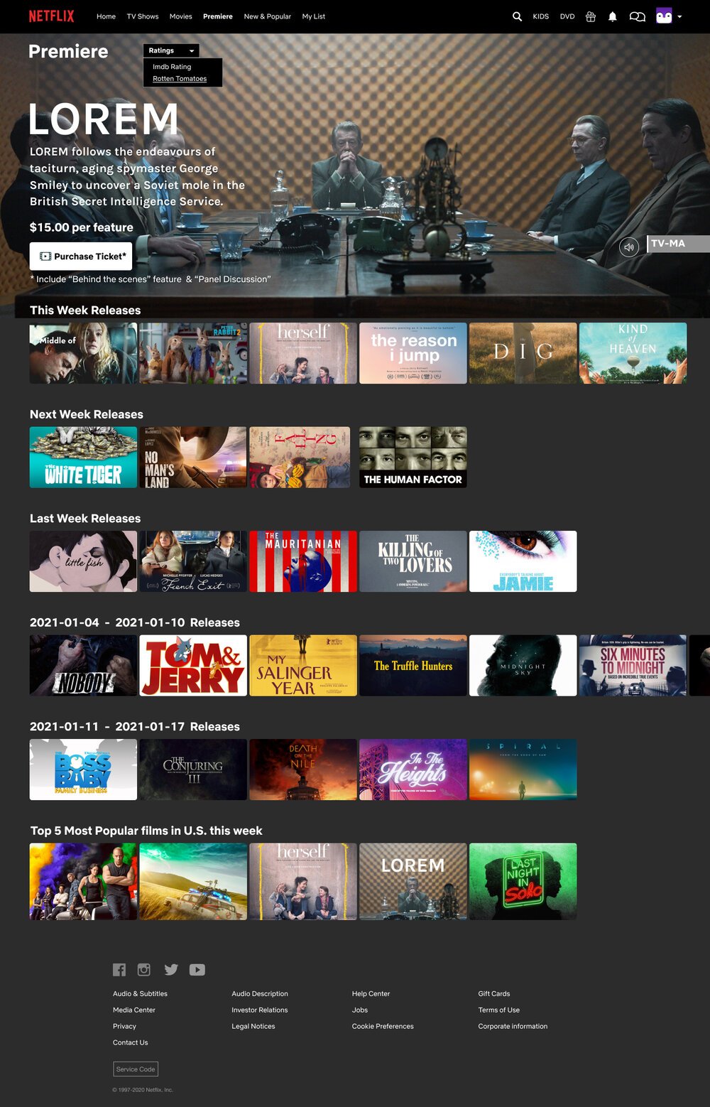
Premiere Landing Page where the new feature will be located
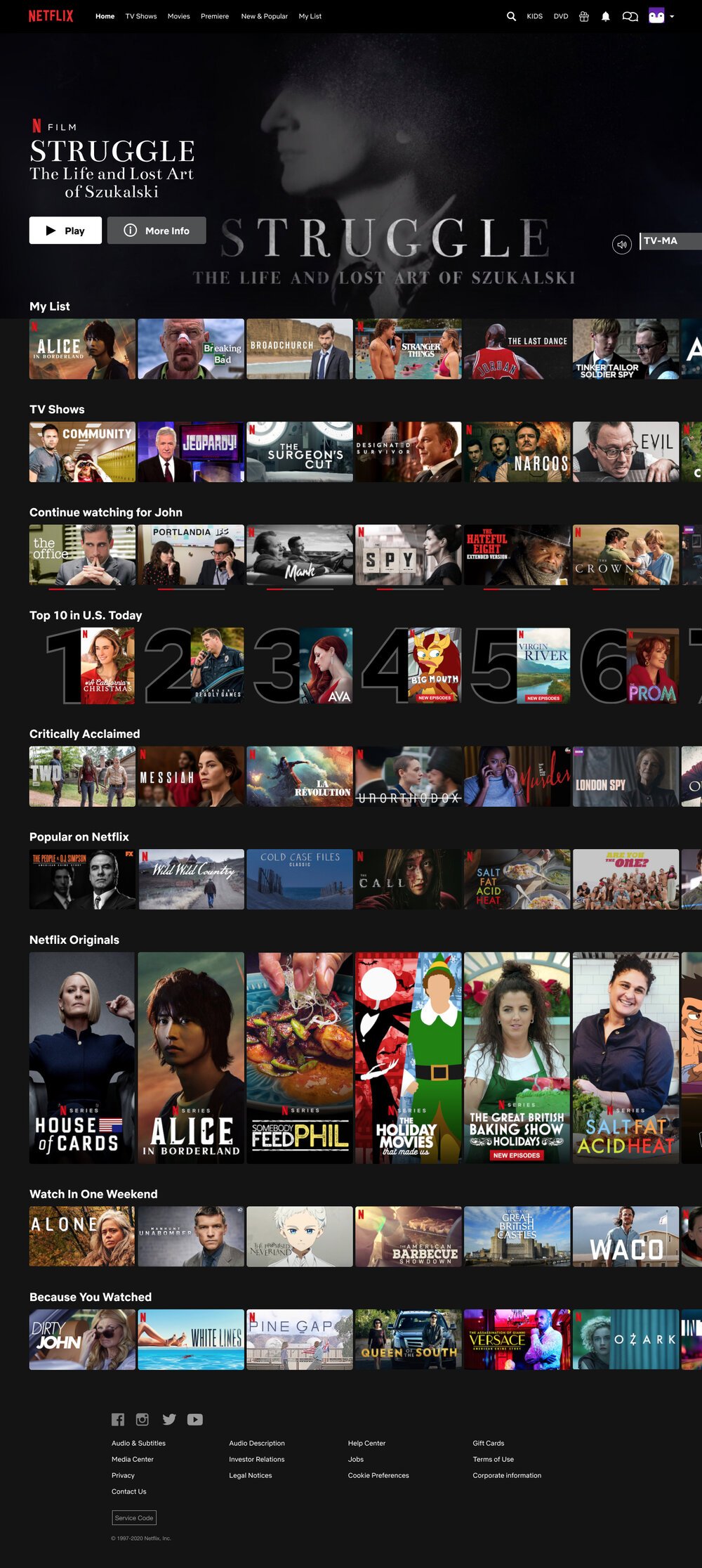
Adjustment on the existing Top Nav
Premiere Check Out Page
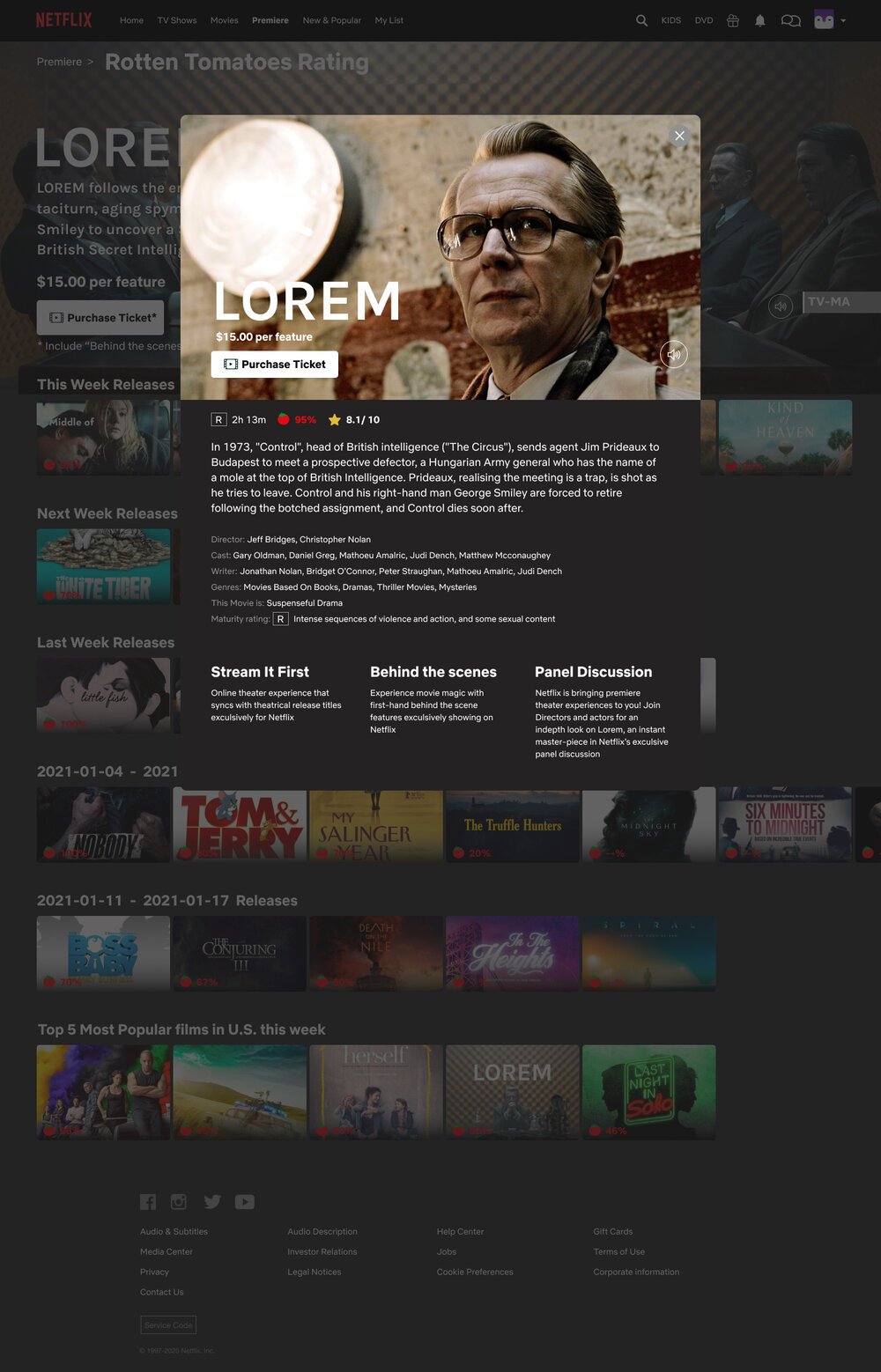
Ability to see "Behind-The-Scene" materials
Ability to sign up with Panel Discussion
Live Panel Discussion Page
Movie Rating Filters
Site Map
Building from the project goals and feature roadmap, I created a sitemap that included not only proposed pages but also one that satisfies user behavior and needs patterns to help visualize how the additional feature would be organized with the hope of creating the most incisive structure possible. We gain a birds-eye view of how pages are prioritized, linked, and labeled with the site map's creation. On this particular project, it is important that the added features (in the color red) function seamlessly with the existing Netflix site map (color black) intuitively and familiarly to new and veteran users alike.
Task Flow
I created 3 task flows for Netflix’s premiere feature. The primary task flow is to construct an easy-to-navigate, immersive checkout experience for users; hence I decided to construct a task flow breaking down the necessary steps for users to get from the home page to the premiere page and ultimately purchase their desired film. The other two task flows are “panel discussion” related. One is for "signing up, and the other is for launching the panel discussion after receiving a notification. Creating these task flows helped identify which pages were required within the customer’s process and forced me to think through the customer experience in detail.
03. Ideate
Wireframes
I created low-fidelity wireframe sketches of possible landing page layouts based on research, goals, and requirements. Once I decided on a visual layout direction for the sketches, I then created mid-fidelity wireframes in Figma, which helped me focus on the basic layout and visualize hierarchy, priority, and flow before implementing the styling. Below are the mid-fidelity wireframes of some of the main screens: Home screen, Premiere screen, Individual movie screen, and Discussion panel sign-up screen. These wireframes are based on one of the homepage sketches and combined with all the research and data collected so far.
Style Tile/UI Kit
After researching Netflix's existing visual style, the "Premiere” Style tile/UI kit is developed. It includes the existing logo, selected colors, fonts, and imagery to represent the brand. This tile style served as the site's interface design foundation.
04. Prototype
UI Design
Based on the wireframe earlier, style tiles fonts, color palette, and imageries are added to the Design's final look.
Netflix Homepage
Home Page Detail Pop Up
Netflix’s Premiere Page
Rating Filter
Rotten Tomatoes Rating on
Premiere Film Detail
Step 1 Choose Your Payment
Step 2 Payment Info
Premiere Film Detail After Purchased
Panel Discussion Pop Up
Panel Discussion Notification
Panel Discussion
High Fidelity Prototypes
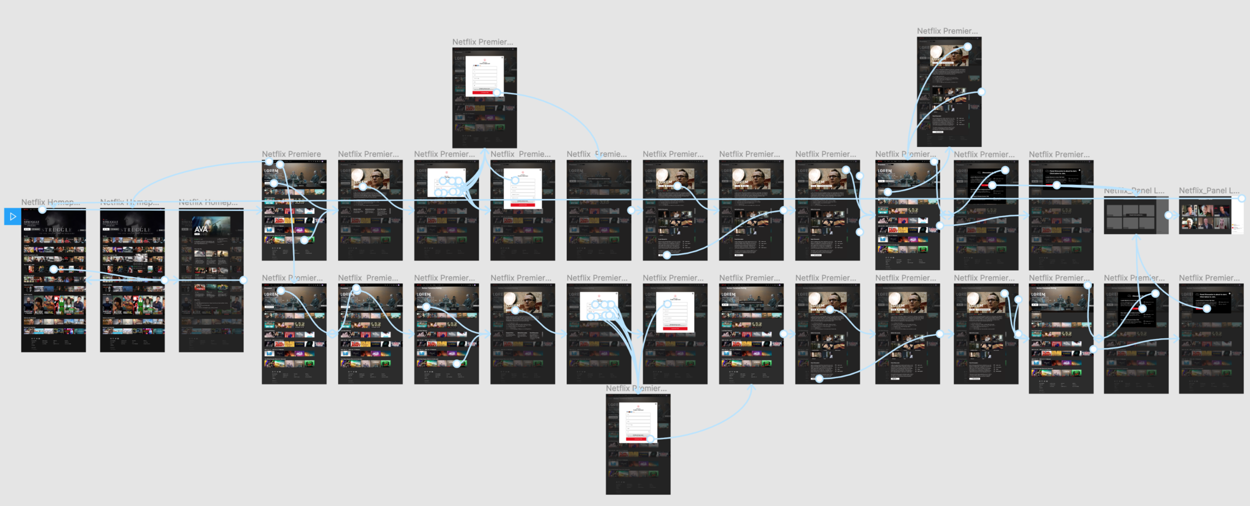
Combining the wireframes with style tile fonts, color palettes, and imageries, various pages were created & added for prototyping and usability testing. Netflix’s premiere prototype took users through navigating the premiere feature, purchasing a theatrical release, and RSVP panel discussion. An interactive Figma Prototype was created with the high-fidelity mockups. Below is an overview of all the interactions between screens.
05. Test
Before conducting usability testing, I first developed a testing plan that outlined the project goals, objectives, and procedures.
Usability Testing
Uncover problem areas where users have issues or problems with.
Evaluate if this feature works seamlessly with the existing site
Test overall usability and flows by observing the user navigate through the “Premiere” feature
Test whether users can find and purchase tickets for a specific movie.
Test whether users can find, RSVP, and Launch Panel Discussion on the “Premiere” feature
Discover any confusion, pain points, and opportunities for improvement.
5 participants, 3 females, and 2 males.
Their ages range from the early 30s to the late 40s. Testing will be conducted using either Skype & Zoom.
5 out of 5 Participants find the overall visual aesthetic of the “Premiere Feature” pleasing.
5 out of 5 Participants find this “Premiere Feature” useful and would love to try it out when launched.
5 out of 5 Participants find the “Premiere Feature” visually cohesive with the existing Netflix site.
5 out of 5 Participants find the checkout system straightforward and easy to use.
5 out of 5 Participants find the RSVP process on the “Discussion Panel” very intuitive.
4 out of 5 Participants find the RSVP placement on the “Premiere Feature” convenient.
4 out of 5 Participants wish there was a line of description on what is included with the feature's purchase in the homepage hero.
4 out of 5 Participants like having “Behind the Scenes” included in the “Premiere Feature.”
3 out of 5 Participants have difficulty finding and launching the discussion panel from the top nav area.
4 out of 5 Participants want to launch “Panel Discussion” from the initial theatrical release detail page in the “Premiere Feature.”
5 out of 5 Participants find the “Discussion Panel” Notification pop up very useful and surprising.
Pain points: Users find a disconnect in launching the discussion panel from the top nav.
Pain points: User finds not having a line to describe what’s included with the theatrical release purchase not user-friendly and unenticing.
Suggestion: Adding a line of description on the home page banner to describe what is included with purchasing the theatrical release film on the premiere service.
Suggestion: Adding a second launch portal for the “Panel Discussion” from the movie detail page instead of just launching it from the top nav since many people are not familiar with the Netflix top nav.
Suggestion: Adding the length of playtime to all the “Behind the Scenes” clips.
Revised
Having learned all those info from usability testing, I revised and updated the wireframes and the Figma prototype based on the Affinity Map recommendations.
Next Step
Because of the project's time frame and scope, I designed only the desktop version of the site. The next steps would be creating responsive designs and implementing them for other platforms such as Apple TV, Smart TV, & Tablet apps, etc...
Usability Test Findings/ Affinity Map
Uncover problem areas where users have issues or problems with.
Evaluate if this feature works seamlessly with the existing site
Test overall usability and flows by observing the user navigate through the “Premiere” feature
Test whether users can find and purchase tickets for a specific movie.
Test whether users can find, RSVP, and Launch Panel Discussion on the “Premiere” feature
Discover any confusion, pain points, and opportunities for improvement.
5 participants, 3 females, and 2 males.
Their ages range from the early 30s to the late 40s. Testing will be conducted using either Skype & Zoom.
Reflection
Overall, this new online theater experience will provide a more immersive and engaging viewing experience for Netflix users, and create a stronger connection between fans and the content they love.
My takeaways after working on Netflix’s premiere feature
1. The core of the project should always focus on the user's perspective. My initial user research focuses too much on the branding position and business strategy than the user experience due to my marketing background. Instead of coming up with questions and hypotheses about user presence and behaviors, an assumption was made, and I invertedly jumped to the conclusion without enough user data as proof. It is only until other UX designers’ and mentors' feedback on my initial research that I ultimately correct myself from taking the project down the wrong path. I definitely learned a valuable lesson from this project.
2. I find this project genuinely challenging due to the combination of coming up with solutions for users' needs and desires while concurrently cohering to the existing brand's UI and business goals. Adding features such as “Premiere” into Netflix's existing ecosystem was a great discipline practice for me to consistently ensure that the new screens added look and feel cohesively with the current visual design standards along with the company's business goals while also ensuring that the feature added was the most usable for the users.


