Adobe - Instructional Design
Redesign Adobe Lightroom's tutorial set for improved user experience and learning outcomes.
Context
The aim of this project is to improve the user experience and learning outcomes of Adobe's tutorial set for Adobe Lightroom. The goal is to create a tutorial set that is user-friendly, accessible, and effective in helping users learn how to use Adobe Lightroom.
-
Many users struggle to efficiently learn new software and technology due to overwhelming or confusing tutorials that do not cater to their specific needs and goals. As a result, they may struggle to stay current in their field or may waste valuable time trying to navigate unfamiliar tools.
-
Students, hobbyists and junior professional who want to improve their skills and stay current in their field.
-
Senior Art Director, Instructional Designer, UX Designer, UX Researcher
-
Stakeholders: Senior Creative Director Managers, Global Marketing team
Associate: Creative Director Manager, Creative Directors, Art Directors, Copy Writers, VTS Animation and Post Production, Visual Designers and Myself
-
3 Months, Q1 - 2
-
The new tutorial redesign has received high praise for its ability to simplify instructional design and make Adobe's discover content more accessible to new and non-tech-savvy users, setting a new standard for instructional design and accessibility.
Before
The current approach incorporates complex elements and emphasizes not only the essential instructional images and inline animation but also many additional features that could be overly distracting for users
After
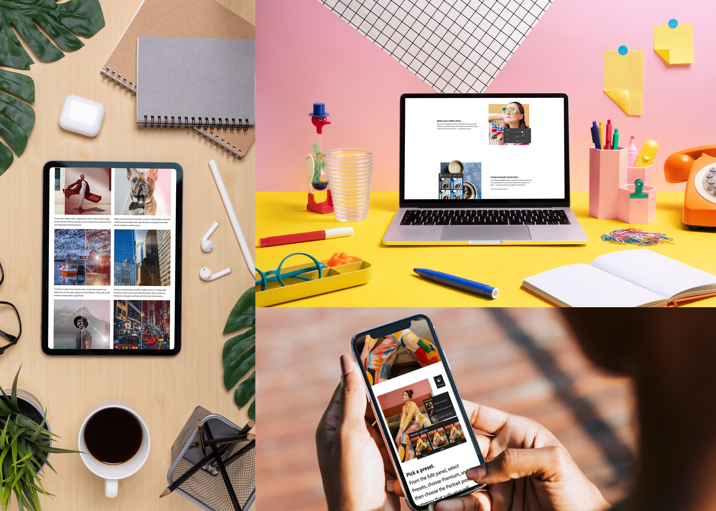
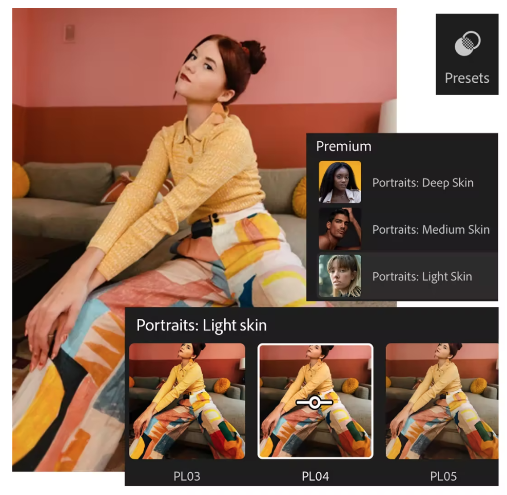
The new approach involves simplifying the App UI by removing complex elements and emphasizing only the essential instructional image and inline animation. Additionally, we condense all the information into a few easy-to-follow steps.
Research
To create effective instructional materials, it's crucial to understand learners' needs, goals, and preferences. This understanding not only helps achieve their learning objectives but also keeps them motivated and engaged in the learning process. Listed below are the research methods used for this project:
User research: Conduct user research to understand the needs, goals, and preferences of the learners. This involve conducting user interviews, surveys, and usability testing to identify pain points and areas for improvement.
Expert review: Conduct an expert review of instructional materials to identify areas where instructional design principles can be applied to improve the user experience.
Content analysis: Conduct content analysis to identify the most important information that learners need to know, and use this information to design instructional materials that are streamlined and focused.
Key Takeaways
Research Findings result on improving effect on our existing instructional design are:
Prioritize user needs: The tutorials should be designed around the needs and goals of the user. Consider what tasks the user is trying to accomplish and design the interface to support those tasks. Avoid cluttering the tutorial with features that are not essential to the user's goals.
Use clear and concise language: Use simple, easy-to-understand language throughout the interface. Avoid technical jargon and confusing terminology that may alienate or confuse users. *Look at Canva as example
Chunking: Breaking down complex information into smaller, more manageable pieces can improve comprehension and retention. This include tutorial steps images and videos
Use consistent design patterns: Consistent design patterns can help users quickly learn how to use all the different the apps. Use the same layout, colors, and typography throughout all the tutorials to create a cohesive design.
Test and iterate: Conduct user testing to identify areas in the tutorial set that are confusing or difficult to understand. Use this feedback to make iterative improvements to the design.
Applying these principles to create how-to content for sophisticated photography and image editing techniques can help to create a more engaging and effective learning experience. Additionally, it is important to consider the audience's existing knowledge and skills when developing the content, as well as providing opportunities for feedback and assessment to support continuous learning and improvement.
Persona
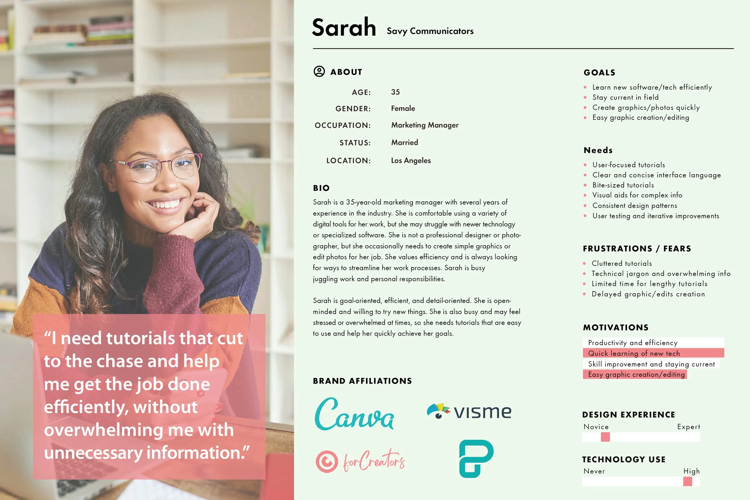
By leveraging the valuable insights gathered from User research, Expert review, and Content analysis, a detailed persona was created to identify the perfect target user. This approach enabled us to infuse personality and context into our research data, enhancing our ability to understand and empathize with our target user throughout the design process.
Design Process
My team designed several prototypes and tested them with stakeholders and our creative ambassadors. I contributed to the project by creating variations of tutorial designs, mid- and hi-fi wireframes, and conducting user testing with them.
Design Prototype
One of the objectives for the redesign is to make the tutorial set as simple and direct as possible since our audience is beginners and non-tech-savvy users. So how do we do that? First, we look at our current Adobe tutorial set and notice that our instructional tutorial-designed images and copy tend to run long and can get very complicated. So for the Self-portraits series, we strip down most of the complex App UI elements, only focusing on the essentials of the instructional image and inline animation; we also distill all the information into a few easy steps.
Furthermore, we have implemented a user-centered design approach, prioritizing the needs and goals of our users. Our team has taken great care to use clear and concise language throughout the tutorials, avoiding technical jargon and confusing terminology. We have also employed the technique of chunking, breaking down complex information into smaller, more manageable pieces, which has been proven to improve comprehension and retention. To maintain consistency and create a cohesive design, we have used consistent design patterns, including layout, colors, and typography, throughout all the tutorials. These design decisions have made the tutorial set as simple and direct as possible, catering to the needs of our beginner and non-tech-savvy users.
Live Pages
Simplify your edits with Lightroom presets.
Create a vibrant background.
Play with perspective.
Moving Forward
The new tutorial redesign has received high praise for its ability to simplify instructional design and make Adobe's discover content more accessible to new and non-tech-savvy users, setting a new standard for instructional design and accessibility. The tutorials are presented in a clear and concise manner that is easy to understand, allowing learners to quickly grasp new concepts. As a result, the series has become a prime example of effective instructional design and accessibility, raising the bar for future content creators. The ultimate goal of this project is to shift the perception of qualitative research by creating instructional materials that prioritize inclusivity and accessibility, driving traffic, trial, and purchases.
New tutorial sets based on the new design


