
Hjem - Furniture App
Hjem - E-commerce furniture app with augmented reality features
Context
Have you ever been in a store and agonized over which piece of furniture you should take home? Which color would match better, maybe? Hjem solves this problem by bringing furniture to your home by using augmented reality (AR). Of course, there are other augmented reality apps in the market, and Hjem is not the first to develop an AR furniture app. However, they aim to do it better and more significantly.
-
Design an app in iOS that allows users to view a furniture catalog and place it in their homes via AR.
Design an app to be able to handle more complex furniture, such as combos or multiple items at the same time.
Design an app that provides an easy search system that can search with keywords and images with the help of image recognition technology.
Design an app that provides an most up-to-date easy checkout system
-
UX/UI Designer, Branding
-
4 weeks
-
The new iOS app provides a seamless and immersive furniture shopping experience, featuring an augmented reality feature and an easy-to-use search system. The app also includes a fast and up-to-date checkout system, ensuring a hassle-free purchasing process for users.

Process Overview

The process can be divided into 5 phases: Empathize, Define, Ideate, Prototype & Test.
01. Empathize
Research Goals
Due to the popularity of augmented reality(AR), many companies are trying to embed the technologies, but the user experience is not quite there. To better implement & incorporate the AR technology into Hjem App, we must learn the current industry user interface standard. By systematically evaluating and listing the competitor’s app interface's overall design; EX: hover states, active states, feedback, etc.; we can discover insight by finding out what works and what doesn’t work by going through a checklist of criteria( Nielsen Norman Group’s The 10 Usability Heuristics for User Interface Design) while evaluating.
Heuristic Analysis
An approach to discovery, learning, and problem-solving that uses rules, estimates, or educated guesses to find a satisfactory solution to a specific issue.

As one of the best apps for designing, building, remodeling, and decorating, Houzz immediately took over the new AR technology. Besides buying (choose among more than 10 million products or use the Visual Match to scan the products from the pictures) and social options (sharing photographs), the user can use View in My Room 3D model to visualize the furniture or decor elements in the surrounding space with the help of AR. After launching the new ARKit in 2017, they have updated the app with new features, adding options to place and move more than 500,000 objects.

IKEA Place gives the opportunity of virtual placement some of the furniture elements from their store. Users can create a complete living room, bedroom, and office with multiple AR furniture. 3D images are quite accurate and can сonvey real-life sizes. Consumers can share the result of the virtual fitting through social media, though consumers cannot shop in the Ikea place app.
Crate & Barrel offers a variety of "upmarket" housewares, furniture, and related merchandise. Launches its own version of augmented reality in 2018. Consumers using a smartphone can go to the product page on Crate & Barrel and tap the “View 3D” button to generate an accurate-to-scale 3D image. The consumer’s smartphone camera launches, and the image then appears in the room using augmented reality (AR) software. Shoppers using a desktop can click on the same button to generate a QR code. Scanning the QR code with a smartphone brings up the 3D image.
Listed below are different states for Main navigation icons, Secondary navigation icons, Shopping cart, Card icons, Search bar, CTA Button, Product detail icon, Buy with Apple pay icon, Slider toggle, etc.… It also showcases different user interface design approaches on new consumer features such as Search with image and Augmented reality(AR); both are a relatively new technology that leaves a lot of room for error. By gathering all this info, we can identify and examine usability success and problems in the user interface (UI) design in the current landscape.


02. Define
Feature Roadmap
After careful heuristic analysis and market research on the industry standard practice, I came up with a list of priorities and features that should be included in this app for a Minimum Viable Product. Listed below is the roadmap for this app stacked in the order of priorities.

Site Map
Building from the project goals, feature roadmap, and card sorting results, I created a sitemap that included proposed pages to help visualize how the site would be organized to create the most incisive structure possible. In addition, with the help of the heuristic analysis of industry-standard practice, I was able to map how the augmented reality feature connects with the rest of the shopping experience.

Task Flow
I created a task flow to focus on what I want my users to accomplish in the MVP. Each of these tasks below represents a way for users to interact with the final product.
The tasks are:
Accessing AR room
Placing Multiple furniture
Purchasing
Search with image

03. Ideate
Wireframes
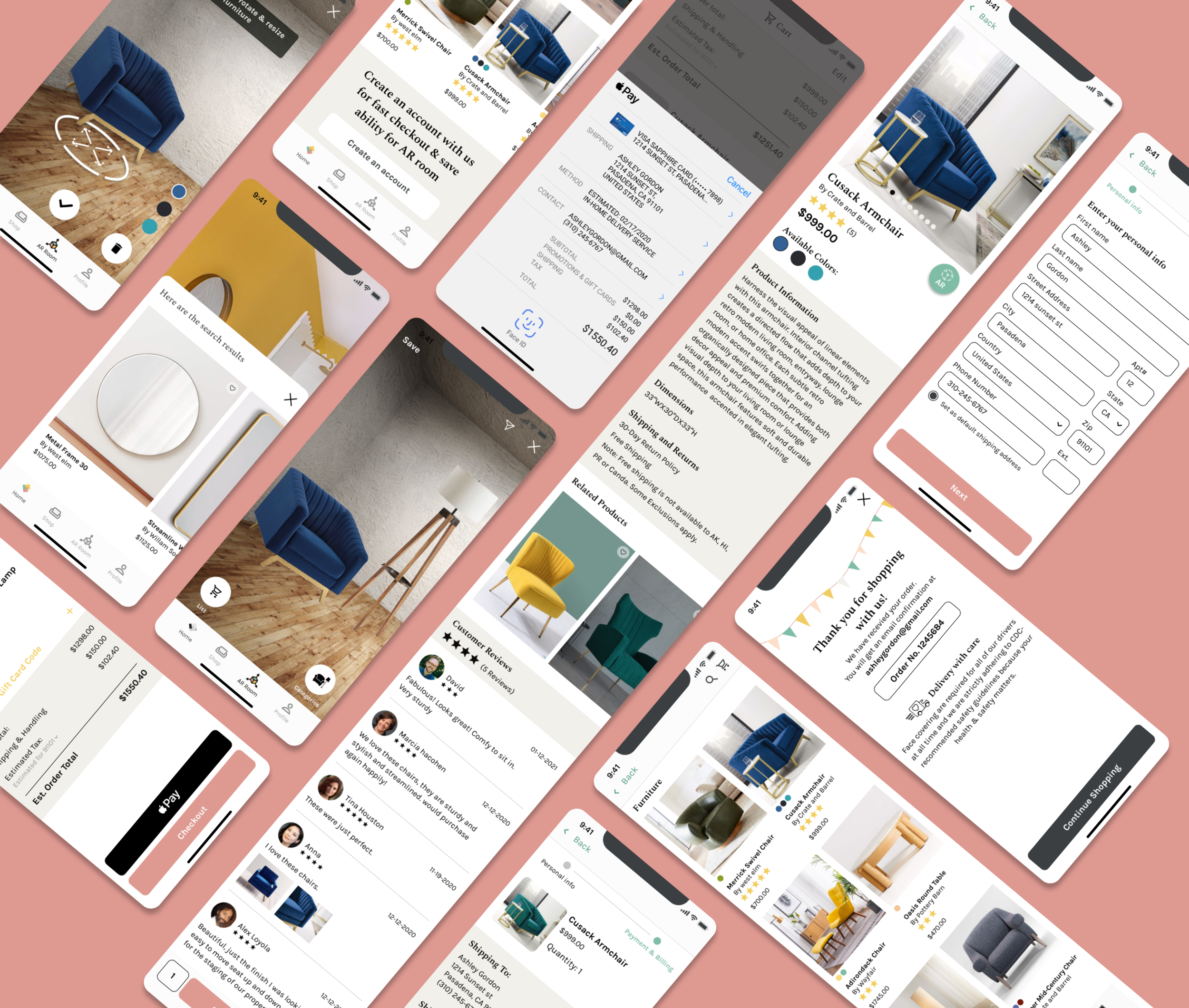
To establish the app's layout, I began the process of sketching low-fidelity wireframes based on the research result from heuristic analysis and site map. It was a good exercise to organize my ideas and get a quick visual representation of the size, spacing, and hierarchy. Once I decided on a graphical layout direction for the sketches, I then created mid-fidelity wireframes in Figma, which helped me focus on the basic layout and visualize hierarchy, priority, and flow before implementing the styling. Below are the mid-fidelity wireframes from some of the apps' main screens: Home screen, Category screen, Product Detail screen, AR Room screen, Cart Review screen, Payment screen, and Order Confirmation screen. The heuristic analysis research results heavily influenced and inspired the layout design. This is to create a better-than-industry standard and unique user interface to increase user experience while using the app.


MoodBoard
Based on the heuristic analysis, I learned that it is important for a successful app to have clean, sleek, and easy-to-use designs. With this in mind, I started to concept out the mood, color, and style for the prototype app with the mood board below.

04. Prototype
Brand Logo
Hjem - a Norwegian word for home, place of origin, or belonging.
Combine the idea of home, overview floor plan for furniture placement, Scandinavian quilt, folk arts, and mid-century modern color palette & geometrics patterns. A list of mock ups was created

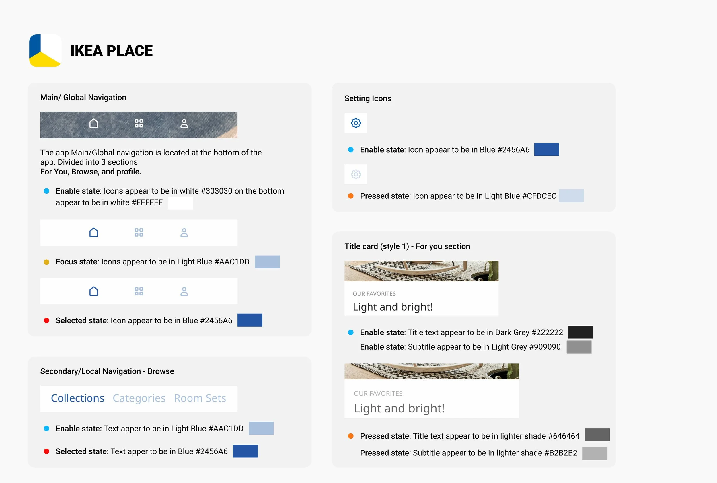
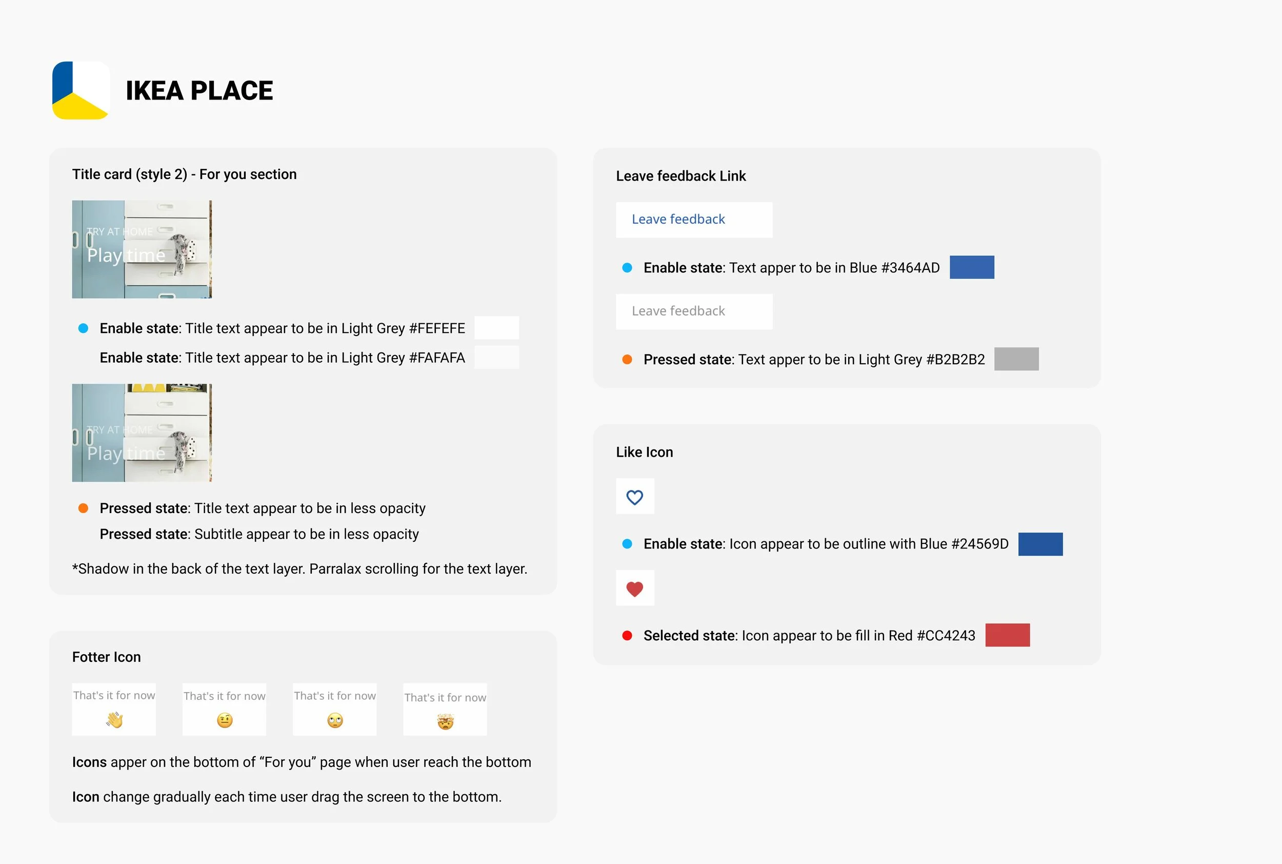
Style Tile/UI Kit
The theme of clean, modern yet warm & welcoming visual direction was further developed in the Style Tile& UI kit. It includes colors, fonts, imagery, button & icon style, and button state, etc.…… This style tile served as the foundation of the site's interface design.


UI/ Responsive Design
Based on the responsive wireframe earlier, style tiles fonts, color palettes, and imageries are added to the apps' final look. Listed below is the video showcasing the app functionality and user interface screens from the app.

05. Test
Before conducting usability testing, I first developed a testing plan that outlined the project goals, objectives, and procedures.
Usability Testing
Uncover problem areas where users have issues or problems with.
Test overall usability and flows by observing users navigate throughout the site.
Test whether users can locate a specific product by browsing through the categories.
Test whether users can locate, access, and place multiple products in the AR room.
Test the usability of the checkout processes “search with image” usability
Discover any confusion, pain points, and opportunities for improvement.
5 participants, 4 females, and 1 male. Their ages range from the mid-20s to the mid-40s.
There are a total of 4 tasks given to participants.
Usability Test Findings/ Affinity Map

Summary of Findings:
5 out of 5 Participants find the overall visual aesthetic & branding of the Hjem app pleasing.
5 out of 5 Participants find this Hjem useful and would love to try it out when launched.
5 out of 5 Participants find locating a product easy to use & intuitive.
5 out of 5 Participants find the Apple pay & checkout system convenient and easy to use.
4 out of 5 Participants find the “Search with image” function easy to use.
3 out of 5 Participants have encountered some problems in the AR room, such as locating the “categories button,” “ability to throw out individual product,” “more guideline captions on the top.”
Pain points: Users have a hard time locating and finding the “Search with image" icon in the app.
Pain points: Users want more function and guidelines while using the AR room.
Pain points: Users want to have an additional way to remove items in the cart and checkout instead of relying on the edit button and swiping left to delete.
Suggestion: Use a different color to indicate the “Search with Image” icon. Fixed
Suggestion: Putting labels under each icon in the AR room to enhance user clarity to identify each icon. Fixed
Suggestion: Adding additional detailed descriptive captions on the top of the AR room to guide users. Fixed
Suggestion: Adding an ability to throw out an individual product by clicking on them and then clicking the “trash can” icon next to it to throw it away from the AR room. Giving users more options and control in the AR room. Fixed
Revised
Having learned all those info from usability testing, I revised and updated the wireframes and the Figma prototype based on the recommendations drawn from the Affinity Map.
Next Step
Because of the project's time frame and scope, I designed only phase 1 and phase 2 of the app. The next steps would be creating phase 3 and phase 4 features such as expanding the on-boarding procedures, AR room sharing ability, AR room inspiration board, etc...
Reflection
After completing the project, I have successfully designed an iOS app that provides users with a seamless and immersive furniture shopping experience. The app features an augmented reality feature that allows users to view and place furniture in their homes. I have also developed the app to handle more complex furniture such as combos or multiple items at the same time.
Additionally, I have implemented an easy-to-use search system that utilizes image recognition technology to enable users to search for furniture using keywords and images. The app also features a checkout system that is fast and up-to-date, ensuring a hassle-free purchasing process for users.
Overall, the app provides a user-friendly and comprehensive solution for furniture shopping, incorporating the latest technology to enhance the user experience.
My takeaways after working on Hjem app
Since I have never worked on designing an AR feature, this capstone was challenging in many ways. With my mentor's suggestion, I did a heuristic analysis of competitors' apps to understand the industry's standard practice in the industry & design patterns that users are familiar with. Secondly, due to the program's limitations (Figma), it was hard conveying AR features on wireframes and high-fidelity prototypes. So when it comes to usability testing, I had to provide additional guidance for my users and asked them to use their imagination and visualize this prototype as a 100% functional mobile app. Of course, I could only discover & overcome these challenges after my initial try out with a fellow UX student.
Overall, this project helped me gain more confidence in designing features I do not have much experience. It is truly an enjoyable learning experience for me.